Lesson 6
What Are All These Indicators Actually Measuring?
Use five questions about input, calculation, window, output, and omissions to understand what common indicators do and do not describe.
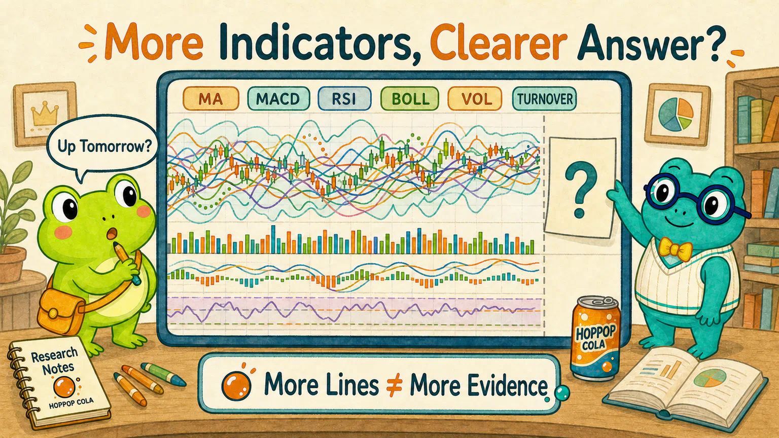
Hoppy opened a fictional market chart for HopPop Cola.
He added one moving average.
Then another.
Next came MACD, RSI, Bollinger Bands, volume, and turnover rate.
Within seconds, coloured lines, bars, and bands were packed across the screen. It looked as if someone had dropped an entire box of crayons onto the price chart.
Hoppy stared at the result.
“Excellent. Which one tells me whether the price will rise tomorrow?”
Dr. Hop covered the not-yet-existing part on the right-hand side of the chart.
“Do not begin with tomorrow.”
“Begin by asking what data these lines swallow—and what numbers they produce.”
An Indicator Is More Like a Juicer Than a Crystal Ball
In the previous lesson, we placed daily closing price, trading volume, and market capitalization into data fields.
Indicators usually process those records further.
One may average the most recent prices. Another may compare upward and downward moves. A third may divide trading volume by the number of shares available for trading.
Change the way we process the same box of ingredients, and we get a different description.
When you meet an unfamiliar indicator, therefore, do not begin by memorising its abbreviation. Do not immediately search for its “most accurate settings,” either.
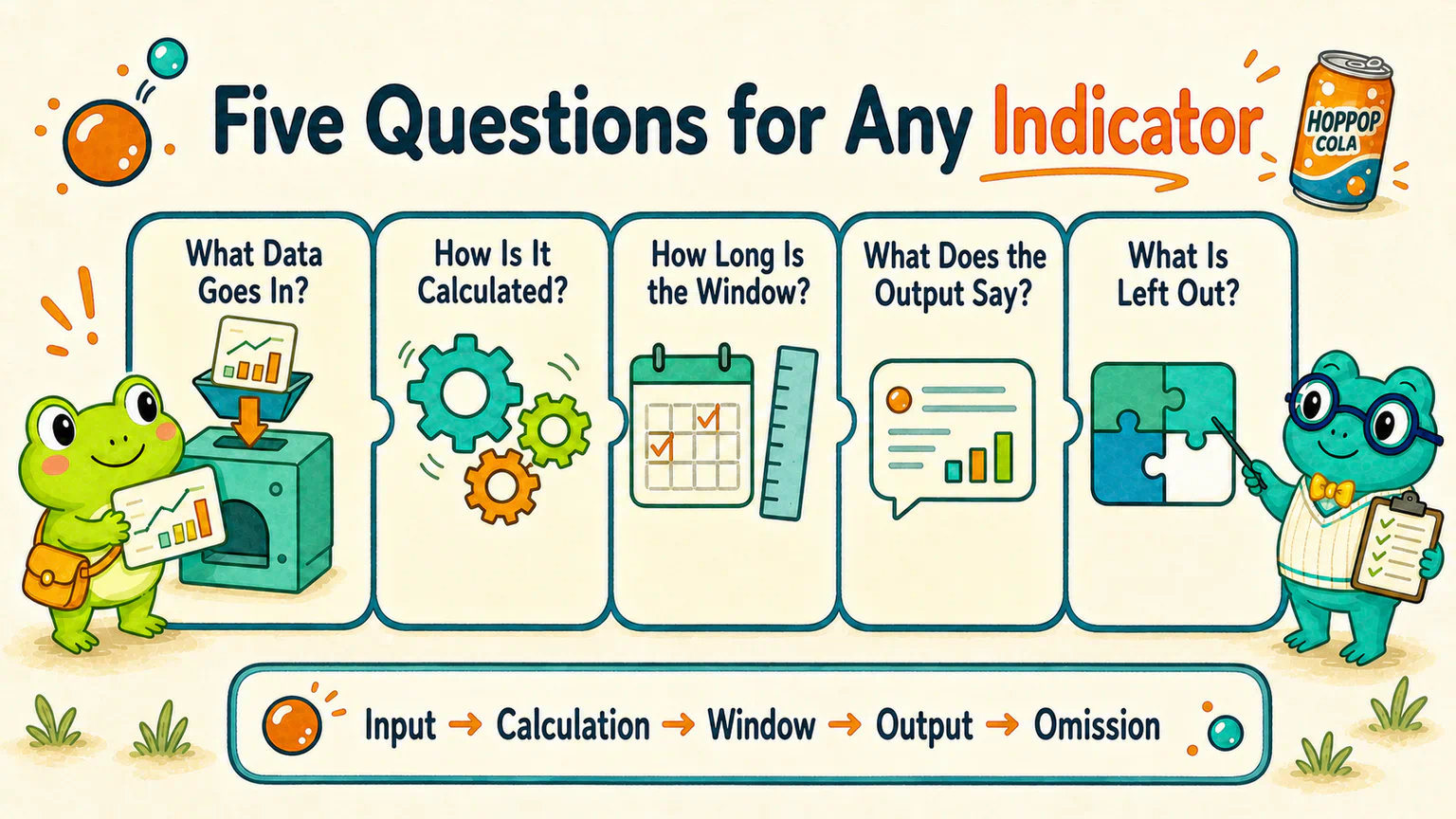
Begin with five questions:
- What data goes in? 2. How is that data processed? 3. How far does each calculation look back? 4. What does the output describe? 5. What does it leave out?
In more formal language, these five questions concern the input, calculation, window, output, and omission.
We will use the same questions to take apart every ruler in this lesson.
Moving Average: Smoothing a Wobbly Price Rope
We can begin with the easiest ruler to understand.
Suppose HopPop Cola closed at these prices over the past three trading days:
10 yuan, 11 yuan, 12 yuan
Add them and divide by three. The result is 11 yuan.
That 11 yuan is not a new traded price. It is not the program's guess for tomorrow, either.
It is simply the average of the latest three closing prices.
On the next trading day, the window moves forward. The oldest price leaves, a new price enters, and the average is calculated again. That is why the line moves through time.
This is the plainest form of a simple moving average (SMA).
Now apply the five questions:
- What goes in: a series of historical prices, commonly closing prices;
- How it is processed: every price in the window receives equal weight, then the average is calculated;
- How far it looks back: the researcher chooses the window length;
- What it describes: the approximate price level and a smoother view of direction over that period;
- What it leaves out: why the price changed, and where the next price must go.
A shorter window usually responds to a new price more quickly. A longer window is usually smoother and responds more slowly.
This is not a contest over which parameter is more advanced. Different windows observe different time horizons.
EMA: Giving Recent Events a Little More Time at the Microphone
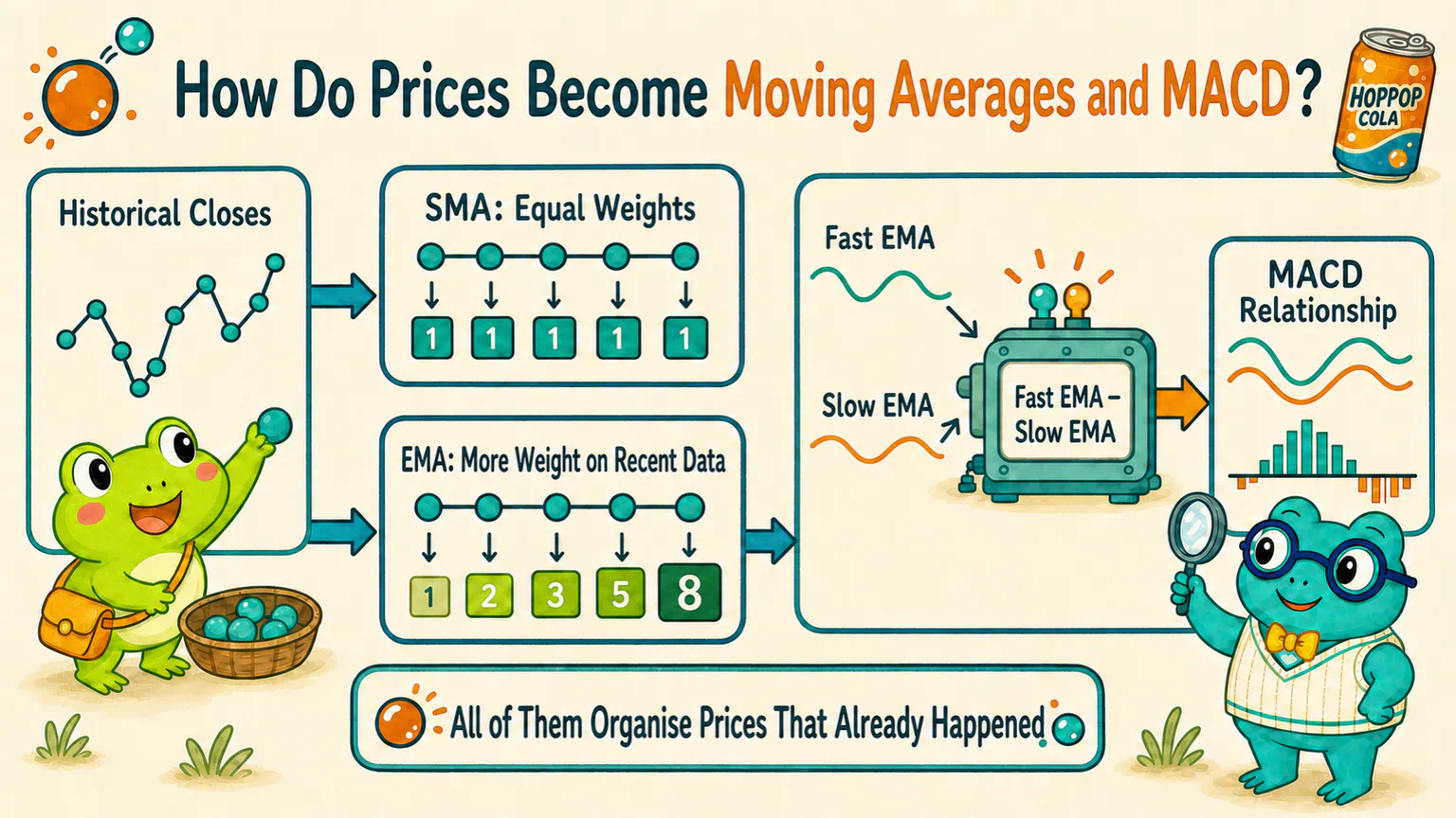
Another familiar moving average is the exponential moving average (EMA).
It does not give every observation exactly the same weight. More recent records receive greater weight, while the influence of older records gradually decreases.
Imagine an SMA as a round-table discussion: everyone in the window receives the same speaking time.
An EMA tilts the microphone slightly towards the people who have just arrived.
With otherwise similar settings, an EMA will therefore tend to respond to recent changes faster than an SMA.
“Responds faster” still does not mean “sees further ahead.” It is simply another way of organizing prices that have already happened.
MACD: Comparing Two Smoothed Lines with Different Speeds
Once we understand EMA, MACD becomes much less mysterious.
It begins with two exponential moving averages that respond at different speeds: one faster and one slower.
It then looks at the gap between them.
fast EMA − slow EMA
When recent price movement is stronger, the faster line may move first and pull away from the slower one. When that movement weakens, the gap may narrow.
Many platforms smooth this gap again and draw bars showing the difference between those two lines.
On Chinese market-charting platforms, you may see the labels DIF, DEA, and MACD bars. English-language material often uses MACD line, signal line, and histogram. Platforms may differ slightly in naming and in how the bars are scaled, so a researcher must check the definition instead of recognizing a color and moving on.
Apply the five questions:
- What goes in: usually historical closing prices;
- How it is processed: calculate fast and slow exponential smooths, compare their gap, and smooth that gap again;
- How far it looks back: the fast, slow, and additional smoothing steps each have parameters;
- What it describes: the relationship between two smoothing speeds, including whether their gap is widening or narrowing;
- What it leaves out: why that relationship changed, and whether the price must continue or reverse afterward.
A growing MACD bar describes a changing gap inside this calculation. It is not a bar chart of future returns.
RSI: Have Upward or Downward Moves Been Stronger Recently?
RSI stands for Relative Strength Index.
The word “relative” is easy to mishear.
RSI usually does not compare HopPop Cola with the CSI 300. It compares upward and downward changes within the price series itself over a chosen window.
After smoothing and rescaling, the result lies between 0 and 100.
Apply the five questions:
- What goes in: upward and downward changes between consecutive closing prices;
- How it is processed: organize recent gains and losses separately, then calculate their relative relationship;
- How far it looks back: the RSI window determines that;
- What it describes: whether upward or downward moves have recently had more weight, and by how much;
- What it leaves out: why those moves happened, and the date on which a reversal must occur.
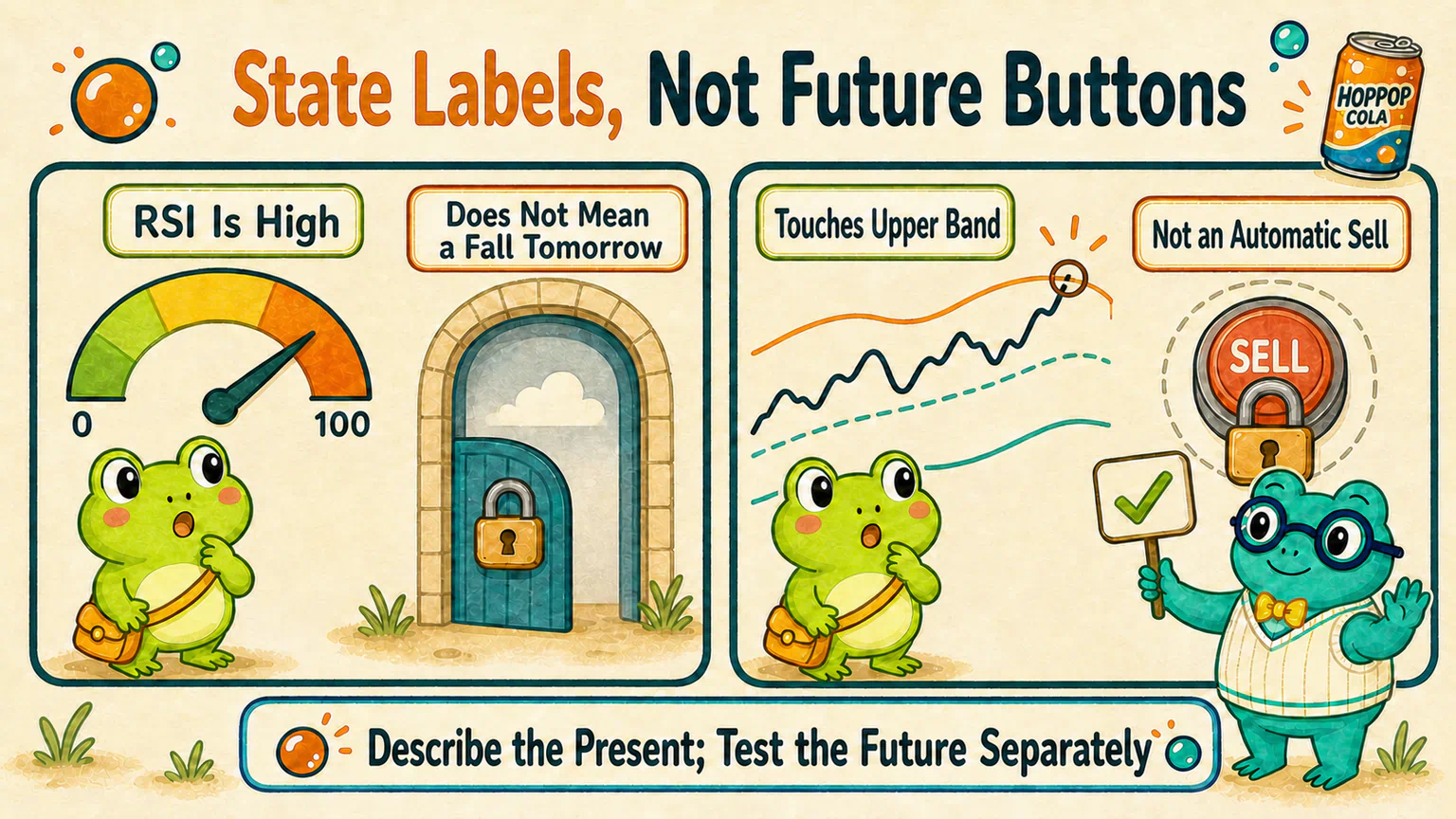
People commonly call some higher regions “overbought” and some lower regions “oversold.”
Those names make this shortcut tempting:
overbought = about to fall
oversold = about to rise
The indicator itself does not say either sentence.
It only says that, under the current window and calculation, recent upward or downward movement occupies a particular relative position. During a sustained trend, RSI can remain in a higher or lower region for some time.
Whether a state label is related to later outcomes is a separate hypothesis that needs evidence.
Bollinger Bands: Where Is Price Relative to Its Recent Center and Variation?
Bollinger Bands usually contain three lines:
- the middle line is a moving average;
- the upper and lower bands spread around it according to recent price variation;
- the bands will generally widen when recent variation increases and narrow when it decreases.
The bands mainly provide a relative position: is the current price relatively high, low, or near the middle compared with its recent center and range of variation?
Apply the five questions:
- What goes in: usually historical prices;
- How it is processed: a moving average describes the middle, while recent variation determines the distance of the upper and lower bands;
- How far it looks back: both the center and variation depend on a window and other parameters;
- What it describes: the relative position of price and the width of its recent variation;
- What it leaves out: that touching the upper band must lead to a fall, or touching the lower band must lead to a rise.
John Bollinger, the creator of Bollinger Bands, explicitly notes that a touch of the upper band is not, by itself, a sell signal.
A touch of the lower band does not become an automatic bottom-fishing button, either.
RSI regions and Bollinger Band touches are state labels first.
A label may help us write a hypothesis, but it is not the result of a forecast.
Volume and Turnover Rate: How Busy Is the Room, Not Which Way Will Price Go?
Trading volume is slightly different from the tools above.
Volume is closer to a raw market record: how many shares traded during a period.
Turnover rate adds a standardisation step by comparing volume with some definition of shares available for trading.
Why bother with that extra step?
The same one million traded shares may be ordinary for a company with a very large float and unusually active for one with far fewer tradable shares.
Turnover rate tries to answer: relative to the amount of stock that can circulate, how active was today's trading?
But rules and data providers may use non-restricted shares, free-float shares, or another clearly defined denominator. Tushare, for example, provides turnover fields based on different float definitions. The words “turnover rate” are not enough; we still need to check the denominator.
Apply the five questions:
- What goes in: trading volume and some measure of total or tradable shares;
- How it is processed: volume is expressed relative to the selected share-count definition;
- How far it looks back: it may describe one day or be processed further over a period;
- What it describes: how active trading was relative to the tradable scale;
- What it leaves out: whether those trades were mainly optimistic or pessimistic, and which way price must move.
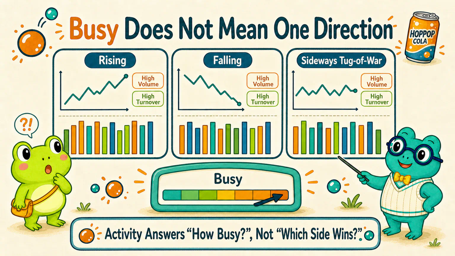
High turnover can appear on a rising day, a falling day, or a day full of noisy disagreement.
It tells us that “the room is busy.” It cannot, by itself, tell us which side will win.
Change the Window, and the Same Ruler Gives a Different Reading
Suppose HopPop Cola rises for several days and then suddenly falls back.
A short moving average may already turn sharply, while a long moving average still looks steady. A short-window RSI may change dramatically, while a longer-window reading moves much less.
Which one is lying?
Perhaps neither.
They are answering questions about different time ranges.
Parameters and windows are therefore not decorations selected by the charting app. They are part of the research definition.
If we keep changing them after seeing the result until the chart “finally gets it right,” we may only have created a ruler that happens to fit this particular piece of history.
Five Indicators Agreeing May Still Mean One Box of Ingredients
Hoppy could now understand more of the lines. That gave him another idea.
“If the moving average, MACD, RSI, and Bollinger Bands all agree, does that count as four votes?”
Not necessarily.
These indicators mostly begin with the same historical price series. They simply process it in different ways.
They are more like four cooks turning the same box of apples into juice, purée, jam, and pie.
The results are genuinely different. But we should not pretend the ingredients came from four unrelated orchards.
Multiple indicators can provide different descriptions. Four colors on a chart do not automatically become four independent pieces of evidence.
You Do Not Need to Memorize the Rest of the Menu
Markets contain many more tools: KDJ, ATR, OBV, CCI, and others.
This lesson will not squeeze all of them into one catalog, and you do not need to memorize a complete indicator table.
When you meet an unfamiliar name, return to the five questions:
What is the input?
How is it calculated?
What is the window?
What does the output describe?
What does it leave out?
If you cannot yet explain the input and calculation, do not rush to trust the color that an app has assigned to it.
An indicator organizes records that have already happened into a description.
Whether it is related to a later outcome requires a separate hypothesis and a separate evidence check.
Next: An Indicator Lit Up—Can We Buy Now?
Hoppy closed most of the lines and kept only daily closing price and one moving average.
The screen became much calmer.
Then he immediately asked another question:
“If price crosses the moving average from below, surely that counts as a signal?”
That is the problem we will take apart next.
References
Sources checked on August 14, 2026
- pandas rolling-window documentation and exponentially weighted window documentation, used to check the basic relationships behind rolling and exponentially weighted calculations;
- TA-Lib function list, momentum-indicator documentation, and overlap-studies documentation, used to check the input, output, and parameter structure of SMA, EMA, MACD, RSI, and BBANDS;
- John Bollinger's official explanation and Bollinger Band rules, used to check their relative-high-and-low interpretation and the warning that an upper-band touch is not a sell signal by itself;
- Shenzhen Stock Exchange special trading rules and Tushare daily-indicator documentation, used to check turnover as volume relative to a tradable-share definition and the existence of different float-based denominators.
HopPop Cola, every price record, and every indicator state in this lesson are fictional teaching examples. They do not refer to a real company, security, return, or strategy. Indicator names, initial values, scaling, missing-value treatment, volume units, and share-count definitions can differ across software and data providers; real research must check the implementation it uses. Nothing in this lesson is a parameter recommendation, trading signal, or investment advice.
Lesson discussion
Share a question, insight, or different view—and see how other learners are thinking.