Lesson 1
Why Can One Stock Have a Hundred Explanations?
Place company, industry, economy, policy, participants, information windows, and market traces on one factor map.
During lunch, Hoppy dropped a screenshot from his market app into a group chat.
“Why is HopPop Cola down today?”
The answers piled in almost immediately.
“The new-product buzz is over.”
“Sugar and packaging are getting more expensive.”
“It isn’t just HopPop. The whole beverage industry looks weak today.”
“People are being more careful with money. Drinks will feel that too.”
“Could it be the new policy?”
“Big money is getting out.”
“Just look at the chart. It broke down.”
Hoppy counted them.
One stock. Seven explanations. Everyone answered quickly, and every answer sounded at least a little plausible.
“I asked why one stock fell. How did I end up with seven different diagnoses?”
Dr. Hop did not choose an answer for him.
“Don’t turn it into a seven-option quiz yet. Those answers are not even talking about the same layer.”
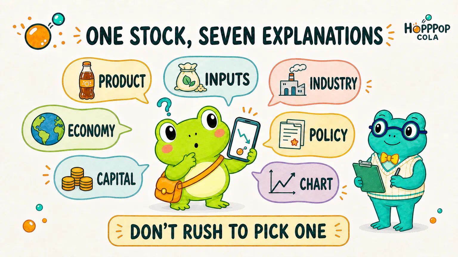
Do not rush to pick the “right” answer
For now, all seven messages are only possible explanations.
We have not checked how the product is actually selling. We have not looked at input costs, industry performance, policy documents, or real trading data. Adding a smooth-sounding story after a stock falls is not the same as finding the cause.
The replies are still useful, though.
Together, they have already sketched most of the map we are about to explore:
- one person is talking about the company’s own business;
- another is talking about the industry around it;
- someone else is talking about the wider economy and policy environment;
- others are talking about investors’ money and mood;
- and a few are looking through windows such as news, prices, and trading volume.
All of these can matter to a stock price. But calling them all “market factors” and tossing them into one box does not help much.
We will not decide who is right yet. First, let us put each explanation roughly where it belongs.
The first layer: the company’s own business
The closest layer to a stock is the company that the shares represent.
Are customers buying HopPop’s new drink? Are older products selling less? How much are ingredients and packaging costing? Is expansion going smoothly? Does the company have enough cash to keep operating?
Those questions live inside the company’s own business.
People often use company fundamentals as a shorthand for this territory. There is no need to memorize the term yet. For now, it means asking a simpler question: How does this company make its living, and is that business becoming stronger, weaker, or merely busier?
The message “the new-product buzz is over” is trying to explain this layer.
Trying is not the same as proving.
The second layer: the industry around the company
HopPop Cola does not sell drinks in a vacuum.
It has competitors. It depends on suppliers for ingredients and packaging. It reaches customers through supermarkets, convenience stores, and delivery platforms. A sudden shift toward unsweetened tea—or an industry-wide price war—could affect many beverage companies at once.
That gives us another set of questions:
- Is this a HopPop problem?
- Are its competitors facing the same change?
- Could one industry change hurt some companies while helping others?
“The whole beverage industry looks weak” belongs to this layer around the company.
It looks beyond one business, but it still does not reveal the true cause. Nor does it prove that every company in the industry should rise or fall together.
The third layer: the wider economy and policy environment
Move farther out, and both companies and industries sit inside a much larger environment.
How willing are people to spend? How expensive is it for businesses to borrow? What is happening to imported input costs? Have the rules for operating changed?
This is where familiar financial-news terms begin to appear: economic growth, inflation, interest rates, exchange rates, regulation, and even geopolitical change.
We do not need to learn all of them in this overview. Keep only a sense of location: some changes begin outside the company, but the company still has to absorb their consequences.
The same external change does not send one identical instruction to every stock.
Higher raw-material prices may raise costs for a beverage company while increasing revenue for a raw-material producer. An exchange-rate move can create different problems for an importer and an exporter.
So “the economy changed” or “policy changed” is not the end of an explanation. We still need to ask: Who felt it first, and what did it actually change?
The fourth layer: market participants have lives of their own
People do not trade only when a company publishes news.
Someone may need cash. Someone else may have to reduce risk or rebalance a portfolio under a fixed rule. Others may suddenly become more optimistic—or more afraid. The company’s office can have a perfectly uneventful day, without so much as a jammed printer, while trading in its shares still changes.
This is the territory that “money is leaving” and “people are getting cautious” are trying to describe.
It reminds us that price changes do not come only from new forecasts about a company. They can also come from investors’ own funding needs, constraints, and emotions.
But “money” and “sentiment” cannot become two magic drawers where we put every move we cannot explain. That would be another way of saying nothing.
We still need to ask: Whose behavior changed? Why? What observable trace did that behavior leave?
Two more windows: messages and market charts
Hoppy rarely gets to see the whole real world directly.
What he sees is a company announcement, a news story, a candlestick chart, or a sudden jump in trading volume.
All of these matter, but they do not occupy the same place on the map.
News and announcements are like windows. They help us learn that something may have happened outside. The event itself and the sentence in the headline are not necessarily the same thing.
Prices and trading volume are more like footprints left after market participants have traded. They can show that transactions occurred and prices moved. They do not automatically add a label beside the print saying:
This decline was caused by weaker sales of the new drink.
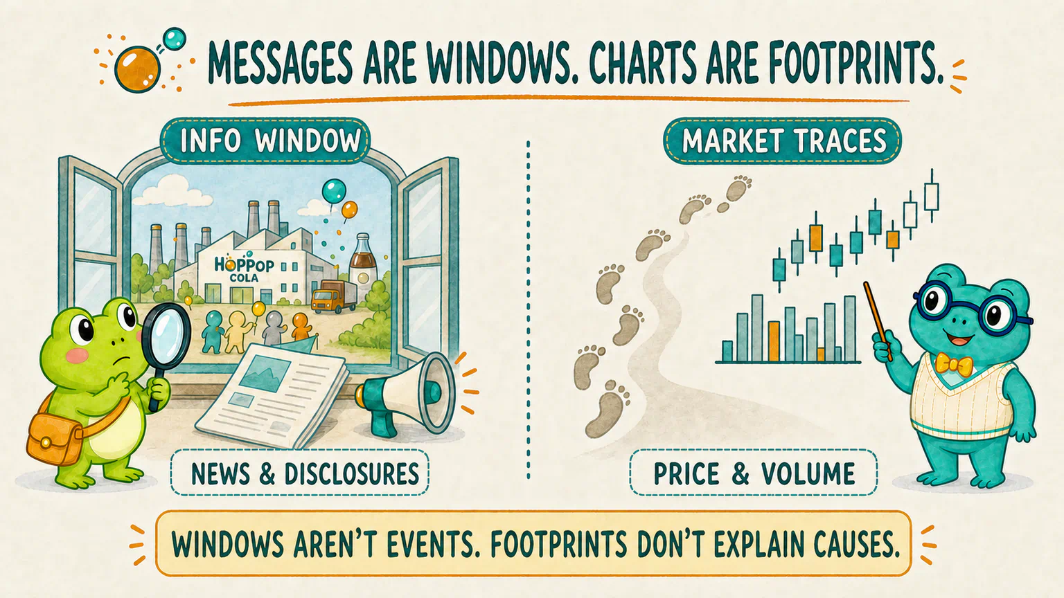
So “the chart broke down” describes the shape left in the market. It does not prove that we have found the one event that created that shape.
Technical analysis mainly studies these traces in price, volume, and trading behavior. We will later separate news, charts, and real-world causes more carefully. For now, remember: a window can help us see the world, but the window is not the whole world.
This course uses China’s A-share market as its main case background. The broad layers in this map—company, industry, economy, policy, market participants, information, and trading traces—are useful across major stock markets. Trading rules, disclosure systems, available data, and the importance of particular forces can differ, so research in another market still needs its own rule and data checks.
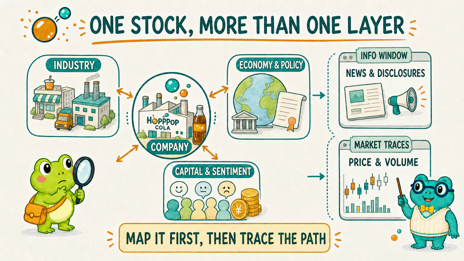
The layers can push one another around
The map now looks neatly divided into several areas.
The real world is not nearly that tidy.
Suppose the price of a packaging material suddenly rises:
An external price changes
→ packaging costs rise across the beverage industry
→ HopPop may earn less in the future
→ some participants revise their views and trades
→ prices and volume leave new traces
That is one possible path, not an automatic program.
HopPop may already have a long-term supply contract. It may redesign the package, raise prices, or sell enough extra drinks to absorb the cost. Competitors may respond in entirely different ways. Even if the cost really rises, the market may have known about it already.
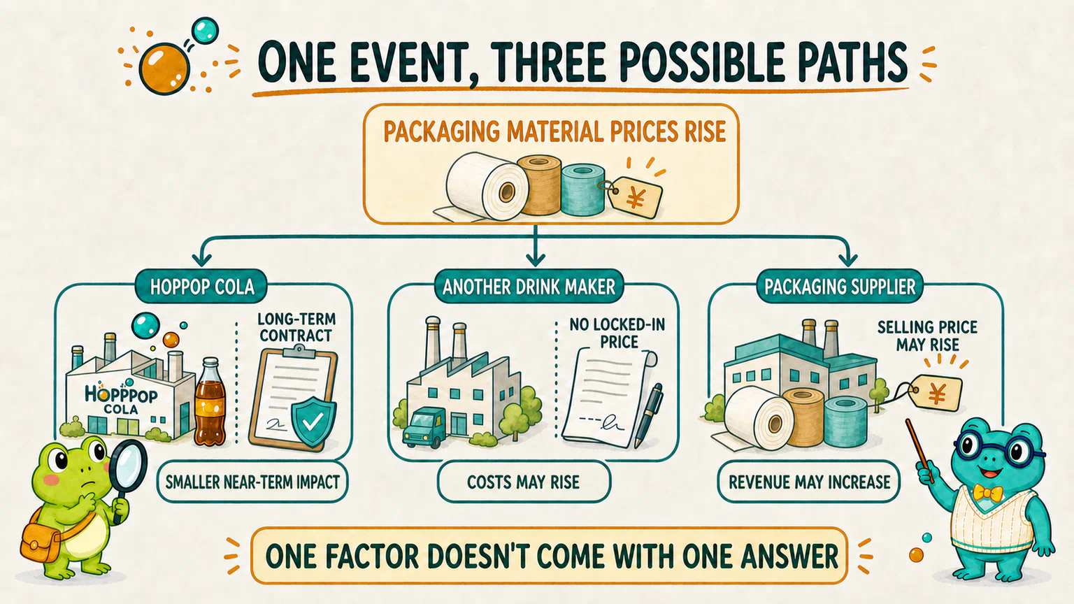
One change can travel through several layers. Companies inside the same layer can still end up with different results.
The point of the map is not to divide the market into sealed drawers. It is to help us find the next useful question when a pile of explanations lands in front of us.
This is not a good-news/bad-news cheat sheet
Used badly, the map can quickly turn into this:
Higher sales = good news
Higher costs = bad news
Policy support = good news
Higher trading volume = good news
Convenient? Yes. Reliable? Not really.
Sales can rise while profits fall because the company cut prices and spent heavily on promotion. A company may pass a higher cost on to customers. Policy support may already be expected. Higher volume tells us that trading became more active; it does not tell us why buyers and sellers acted.
The market refuses to hand us a permanent answer key.
A better start is to ask three questions:
- Which layer of the map is this explanation talking about?
- Whose revenue, cost, choices, or behavior changed first?
- Am I looking at a real-world change, a message carrying it, or a trace left by trading?
Those questions still cannot guarantee that we have found the cause. They can, however, stop many conclusions from arriving far too early.
One stock does not always obey one factor. The company, its industry, the economy, policy, and market participants can all change at once. News and charts are different windows and traces through which we encounter those changes. Put each explanation back on the map before rushing to stamp it “good” or “bad.”
Look at the seven explanations again
Return to the group chat from lunch.
- “The new-product buzz is over” is talking about the company’s business.
- “Sugar and packaging cost more” may travel from an external price through the industry and into the company.
- “The beverage industry looks weak” is talking about a change shared by many companies.
- “People are spending more carefully” points toward the wider economy.
- “It is the new policy” still needs a follow-up: What did the policy actually change, and for whom?
- “Money is leaving” is trying to describe participant behavior, but the claim is still too broad.
- “The chart broke down” describes a trace left in the market.
We still do not know why HopPop Cola fell that day.
That is not a missing answer. The fictional scene simply never gave us enough evidence.
Hoppy looked at the messages and, for once, did not ask which person he should believe.
He circled the first reply instead:
Is the new product really losing momentum?
“So we start with the company’s own business?”
“Yes,” said Dr. Hop. “Start with the layer closest to the company. Whether it eventually reaches the stock price is something we still have to trace step by step.”
Next, we will look at sales, selling prices, costs, profit, and business risk—and see why “the company improved” still cannot be translated directly into “the stock must rise.”
Sources
Sources checked on August 11, 2026
- Investor.gov: Introduction to Investing, for its overview of company management, products, consumer demand, economic changes, labor and supply-chain costs, and changing investor preferences as factors that can affect a stock price;
- Investor.gov: Stocks — FAQs, for its distinction between events inside a company and political or market events outside the company’s control;
- FINRA: What Is Momentum Investing?, for its explanation that technical analysis commonly uses market data such as price and volume, and that industry, macroeconomic, and geopolitical changes can affect stocks;
- Investor.gov: How to Read a 10-K/10-Q, for its distinction among risks unique to a company, shared by an industry or region, or present across the wider economy.
HopPop Cola, the group chat, the price move, the packaging-cost example, and every proposed explanation are fictional teaching material. This chapter offers a beginner’s map for organizing market questions. It does not identify the cause of any real price move and is not investment advice.
Lesson discussion
Share a question, insight, or different view—and see how other learners are thinking.