Lesson 3
The Mean Return Is Higher—So Why Hasn't 8 Won?
Read the mean, median, positive-return share, and full distribution instead of letting one attractive number speak for all the evidence.
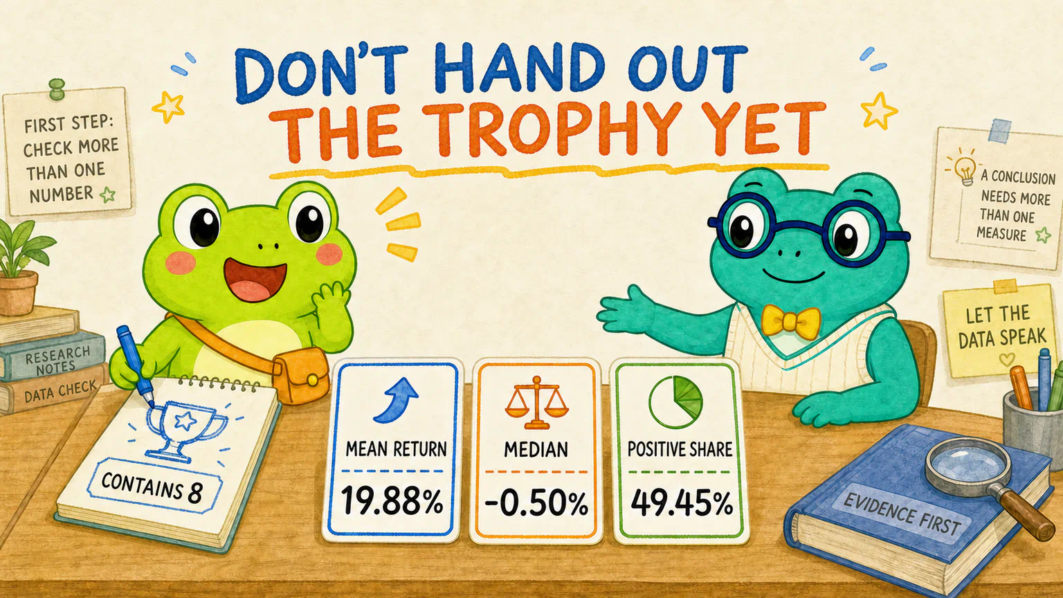
Hoppy opened the result chart from the previous lesson. His eyes went straight to the mean returns.
The contains-8 group had 19.88%. The no-8 group had 14.90%.
“That is almost 5 percentage points more.”
He picked up a pen and drew a tiny trophy beside the contains-8 group.
“I declare 8 the winner.”
Dr. Hop did not take the pen away. He simply pointed to the next row.
“What about the medians?”
They were -0.50% for the contains-8 group and -1.65% for the no-8 group. Both were below zero.
“Well… the contains-8 group still lost a little less.”
“And the positive-return shares?”
49.45% and 46.80%. Neither group reached half, and the gap was not very large.
Hoppy looked at his new trophy, then back at the whole table.
“Why are several numbers describing the same race differently?”
Because they are answering different questions.
The mean did not make a mistake, and the median is not being difficult. The problem begins when we hear the first number and tell every other number to be quiet.
A research result is rarely just one number. Different measures answer different questions. Read them together instead of choosing only the one that supports your original idea.
First, see how many companies stand behind the percentages
The comparison contains 294 fictional companies.
The contains-8 group has 91 companies. The no-8 group has 203.
The groups are not the same size.
That does not mean the experiment went wrong. The groups formed naturally from whether an ID contained the character 8. We did not remove companies just to make the two teams look tidy.
Sample sizes still need to remain visible when we read the result.
“49.45% had a positive return” sounds abstract. Turn it back into companies and it means about 45 of the 91 companies in the contains-8 group had positive returns.
The no-8 group’s 46.80% means 95 of its 203 companies had positive returns.
Percentages help us compare groups of different sizes. Counts remind us how many companies are actually standing behind those percentages.
The mean puts the whole team into one number
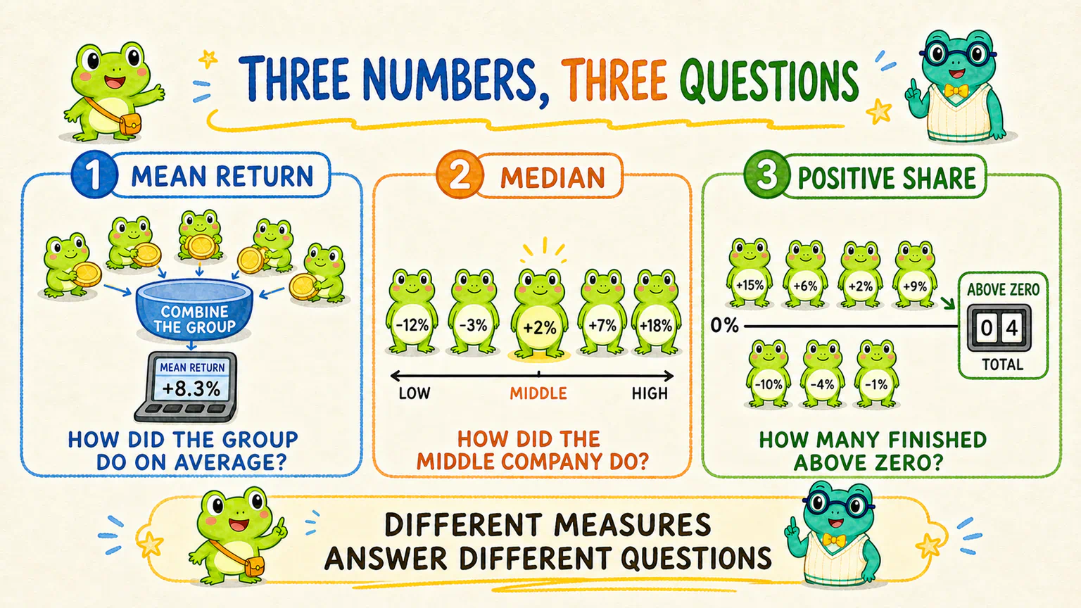
The calculation is simple: add every company’s return in a group, then divide by the number of companies.
It answers this question:
If every company has the same weight, how did this group perform on average?
The contains-8 group’s mean return was 19.88%, compared with 14.90% for the no-8 group. That is a difference of 4.98 percentage points.
We say “percentage points” because we are measuring the distance between two percentages:
19.88% - 14.90% = 4.98 percentage points
So far, Hoppy is right. The contains-8 group really did have the higher mean return.
But the mean has a noticeable habit: a small number of unusually high or low results can pull it away from most of the group.
Imagine five frogs finding 15 coins. Four frogs find one coin each, while the fifth finds 11.
The mean is three coins per frog.
That number is correct. But if it makes you picture every frog finding about three coins, your picture looks nothing like the scene on the ground.
Returns work the same way. A few companies with very large gains can lift the mean for an entire group.
The median looks at the company in the middle
The median does not add all the returns together.
It lines up a group’s returns from lowest to highest, then looks for the middle position.
It is closer to asking:
How did the company around the middle of this group perform?
The contains-8 group had a median return of -0.50%. The no-8 group had -1.65%.
The contains-8 median was still a little higher, but both were below zero.
That means the companies around the middle of both groups had small negative returns over the study period.
This does not prove the mean is false, and it does not crown the no-8 group instead. It simply makes the story “the contains-8 group won easily” much harder to tell.
The positive-return share only counts who finished above zero
The positive-return share does something simpler: it checks how many companies in a group had a study-period return strictly greater than zero.
It does not care whether a company gained 1% or 300%. Anything above zero counts as one positive-return company.
So it answers:
What share of the companies rose during this period?
The contains-8 group had a positive-return share of 49.45%. The no-8 group had 46.80%. The gap was 2.65 percentage points.
Both figures sit near one half.
They tell us that the contains-8 group had a slightly larger share of positive-return companies. They do not tell us that every company in that group gained more.
Maximums and minimums are warnings, not delete buttons
Now look at the most extreme companies in each group.
The contains-8 group ranged from -66.99% to 368.76%.
The no-8 group ranged from -63.98% to 625.12%.
Those maximums sit far above the medians. They help explain why both mean returns are much higher than their medians: a few very large gains are pulling the means upward.
When we find an extreme value, we can ask where it came from, whether the data is valid, and how sensitive the result is to that company.
What we cannot do is delete it simply because it makes the result harder to explain.
If a company satisfies the eligibility rules we fixed in advance, an unusual return is still part of the result. Removing data needs a rule we can defend—not “that dot looks inconvenient.”
Stop staring at three bars and let every company step forward
The result card from the previous lesson was useful for comparing a few summary measures. It did not show where all 294 companies actually landed.
Now ask AI to use the same study-period results and create a company-level return distribution chart.
We are not changing the experiment or choosing new measures. We are only plotting the returns we already calculated so that the distribution hidden behind the mean becomes visible.
Give this to your AI research assistant|Plot the company returns
Continue with the same 294 fictional companies, the same group rule, and each company’s return from 2021-01-04 through 2022-12-30.
Do not change the eligibility rule or select a new set of companies. Do not read, calculate, or reveal 2023 returns. Do not add industry, market cap, P/E, the CSI 300, another digit, or any other variable.
Use a program to create one PNG return-distribution chart. Plot one dot for each company, place the contains-8 and no-8 groups separately, and draw a 0% return line. Clearly show each group’s sample size, mean return, and median return.
Because a few returns are unusually high, include two views in the same image: one showing the complete range so that extreme values remain visible, and another zooming in on the main -100% to 100% range so that most companies are easier to inspect. Both views must use exactly the same data. State clearly that companies outside the zoomed range were not deleted.
Do not add claims such as “8 works,” declare a winner, or draw any trading conclusion. After creating the chart, actually run the program and confirm that the point count, sample sizes, means, and medians match the existing research summary. Then tell me where you saved the image.
This is not an invitation for AI to draw a roughly convincing cloud of dots. Every dot must come from one company’s calculated study-period return.
It is a data chart, not an AI illustration.
What becomes visible when every company steps forward?
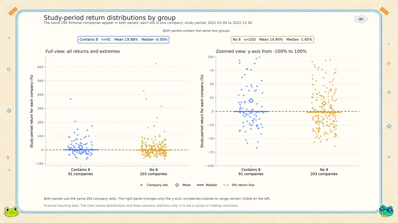
The chart does not show two neatly separated teams.
The contains-8 group includes both positive and negative returns. So does the no-8 group.
Some no-8 companies outperformed most companies whose IDs contained 8. Some contains-8 companies performed worse than many companies in either group.
The two clouds overlap across much of the return range.
That is what summary numbers can hide. A difference between group means does not mean every contains-8 company outperformed every no-8 company.
The full view also preserves the handful of unusually high points. The zoomed view stops the large middle cluster from being crushed into a narrow strip.
Both panels tell us about the same data. One keeps the full picture; the other makes the crowded middle easier to see.
Several measures, several questions
We can now put each result back beside the question it answers.
| Measure | What it answers | What it does not answer |
|---|---|---|
| Mean return | How the group performed on average when every company has equal weight | Whether most companies were close to that number |
| Median return | How the company around the middle of the ordered group performed | How much total influence the most extreme gains and losses had |
| Positive-return share | What share of companies finished above zero | How large the gains were |
| Maximum and minimum | How far the most extreme results reached | Whether those results are errors or should be removed |
These are not four referees fighting for the only vote.
They are more like four windows. Each one shows only part of the room.
Look only at the mean and a few large winners may start to look like the whole team. Look only at the median and you may miss the real effect of extreme returns on the group average. Look only at the positive-return share and you cannot see the size of any gain or loss at all.
How strong should our conclusion be?
If we only read the mean, it is tempting to write:
Companies whose IDs contain 8 had higher returns, so the digit 8 may really work.
That sentence goes too far.
It turns a difference inside one fictional historical dataset into an effect caused by 8. It also ignores what the medians, positive-return shares, extreme values, and overlapping distributions are telling us.
A conclusion that fits the current evidence would sound more like this:
In the Hoppy fictional teaching dataset from 2021-01-04 through 2022-12-30, the contains-8 group had a higher mean return than the no-8 group. However, both medians were slightly below zero, the positive-return shares differed by only 2.65 percentage points, and both groups contained a small number of unusually high returns. The results show some descriptive differences between the groups during this historical period. They do not show that the character 8 caused those differences, and they do not support a forecast or trading rule.
This wording does not pretend that we found nothing.
The mean returns really were different, and we record that honestly.
It also refuses to trim untidy evidence into a slogan just because the original hypothesis was fun.
Ask AI to check whether the wording outruns the evidence
We do not need AI to repeat the calculation. A more useful job now is to give it the wording we plan to save and check whether our conclusion says more than the evidence can support.
Review with Codex
Do not recalculate the study, change any research rule, or read, calculate, or reveal 2023 returns.
Read the current research summary and company return-distribution chart, then review this proposed addition to the summary:
“In the Hoppy fictional teaching dataset from 2021-01-04 through 2022-12-30, the contains-8 group had a higher mean return than the no-8 group. However, both medians were slightly below zero, the positive-return shares differed by only 2.65 percentage points, and both groups contained a small number of unusually high returns. The results show some descriptive differences between the groups during this historical period. They do not show that the character 8 caused those differences, and they do not support a forecast or trading rule.”
Check whether it accurately reflects the sample sizes, mean returns, median returns, positive-return shares, maximums and minimums, and the overlap between the two distributions.
Pay special attention to whether any sentence turns a descriptive difference into a causal claim, stable pattern, future prediction, or trading recommendation. If the wording is too strong, identify the exact sentence and suggest a more restrained plain-language version. Report back to me first; do not edit the file directly.
The goal is not to make AI rewrite the conclusion until it is afraid to say anything.
We simply want its volume to match the evidence: say what we can see, and no more.
After reading AI’s report, decide which wording you actually accept. Once you have confirmed it, ask AI to leave a record:
Save the confirmed reading
Append the “First provisional reading” I just confirmed to the existing research summary. Preserve all existing calculations and content. Do not recalculate the study, change any research rule, or read, calculate, or reveal 2023 returns. When finished, tell me which file you changed and where the new passage appears.
One result usually creates more questions
Hoppy erased the trophy he had drawn, but he did not close the result chart.
“So we know nothing?”
“Of course not,” Dr. Hop said. “We know that the summary measures are not describing the same thing, and we know the two groups overlap heavily.”
“Can I keep asking questions?”
“That is usually how research continues.”
You can now hand the question back to AI. We will not decide what you must ask, and the course will not prepare a standard answer for you.
Keep exploring with AI
Continue using the current study-period data. Do not read, calculate, or reveal 2023 returns, and do not change the original grouping, eligibility, or return-calculation rules.
Based on the existing research summary and company return-distribution chart, suggest several questions that may be worth exploring next. Explain in plain language what each question is trying to understand. Do not run any new analysis yet; wait for me to choose one.
These are exploratory questions raised after seeing the result. Keep them clearly separate from the hypothesis and rules fixed before the original experiment. Do not present a later exploration as if it had always been part of the planned evidence.
AI may notice the extreme companies. It may be interested in the overlap between the groups. It may suggest a question you had not considered.
You do not need to investigate every suggestion. Choose one question you genuinely care about, then ask AI to explain how it would proceed.
Hoppy did not open the envelope containing the 2023 data.
He simply placed a new blank sheet beside the experiment agreement.
The first result did not end the research.
It showed us what we could ask next.
A higher mean return is only one part of the result. Once every measure and every company is visible, we can write a provisional conclusion that is no stronger than the evidence behind it.
Lesson discussion
Share a question, insight, or different view—and see how other learners are thinking.