Lesson 2
Same Return. Same Journey?
Use volatility, maximum drawdown, and the Sharpe ratio to compare the different risk paths behind the same ending return.
Hoppy put the question of who deserved the credit aside for a moment and opened another chart.
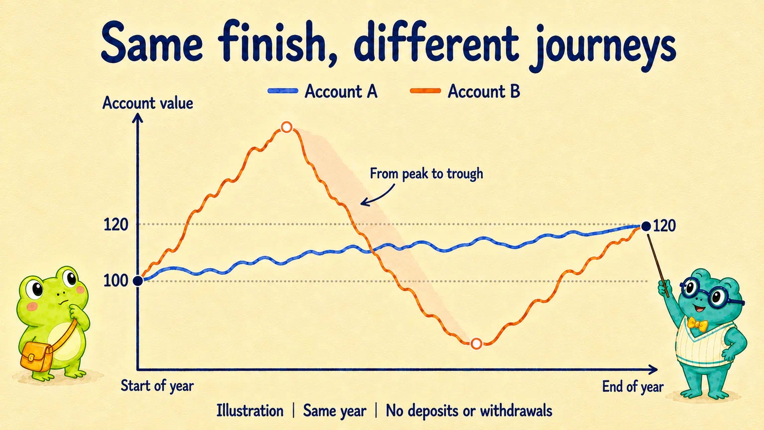
It showed two illustrative accounts. Both started on the same day with 100 units and finished a year later with 120. Neither had any deposits or withdrawals along the way.
“Surely this one's a tie?”
Dr. Hop revealed the rest of the curves.
One account rose and fell a little as it gradually reached 120. The other surged, fell below its starting value, then finally made it back to 120.
“Same result,” said Dr. Hop. “Rather different year.”
Hoppy stared at the second curve. “That account would be terrible for my nerves.”
Before we rank them, notice what the curves are telling us: the final gain is only part of the account's story.
Both gained 20%. How long did it take?
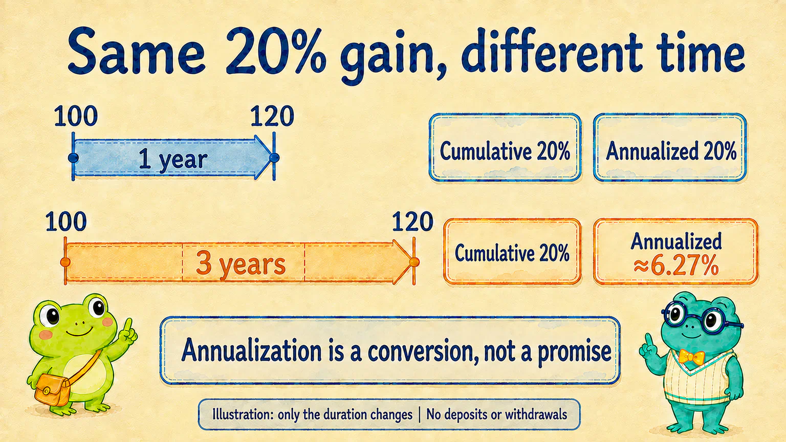
Going from 100 units to 120 adds 20 units. Relative to the original 100, that's a gain of 20%: the cumulative return over that period.
Both accounts took one year, so they really are equal on two counts: how much they gained and how long it took.
Now change just one condition. What if one account took three years, rather than one, to get from 100 to 120?
“Still 20%, but not the same pace,” said Hoppy.
Exactly. When you see a return, don't just admire the number before the percent sign. Look for the time period beside it.
To account for time, we often express a period's return as a yearly growth rate. That's the annualized return.
Think of it this way: if the account grew at one constant percentage each year, with earlier gains staying in the account and growing too, what rate would take it from this starting value to this ending value?
In our example, going from 100 to 120 in one year gives an annualized return of 20%. Taking three years gives about 6.27%—not simply 20% divided by three. FINRA: Calculating cumulative and annualized returns
“So it earned 6.27% in each of those three years?”
Not necessarily. Some years might have made money and others lost it. The 6.27% expresses the existing result in another way. It neither reconstructs each year's actual experience nor promises what next year will earn.
Open up the journey again
Now return to the original pair: both took one year to go from 100 to 120.
If the time period is the same too, why does the second curve still make Hoppy uncomfortable?
Because he's seeing more than the final 20-unit gain. He's seeing all the ups and downs in between.
For a proper comparison, though, “that line looks scary” isn't enough. We can look at the daily returns: do most stay fairly close to their average, or do they frequently land far above or below it?
A common measure of this spread is volatility, often calculated using something called standard deviation. You don't need to learn the calculation yet. Remember what we're measuring: variation in daily percentage returns, not how many units the account holds, and not simply its highest value minus its lowest. CFA Institute: Understanding volatility through standard deviation
“Does a sudden big gain count as volatility too?”
Yes. It doesn't only count falls. Large upward moves count as well.
That's one reason volatility doesn't translate directly into “how dangerous the losses are.” It describes fluctuations, not every kind of risk.
The part that particularly bothers Hoppy—the account reached a high, then fell a long way—brings us back to a measure we already know: maximum drawdown.
Look at the opening chart again. The second account fell from an earlier peak to a later low. Finishing back at 120 doesn't erase that fall from its history.
We can look at both instead of choosing one to replace the other. And the worst drawdown in the record isn't a limit on how bad a future drawdown could be.
What return came with all those fluctuations?
“Then I'll choose the flattest line,” said Hoppy. “If I don't buy anything and just leave the money there, that should do it.”
Focusing only on smoothness can make us forget the other half of the question: what return did the money earn?
Remember the bank-interest analogy from the previous lesson? It helped introduce the risk-free return—a baseline for comparison. It's still an analogy, not a claim that every bank deposit is completely risk-free.
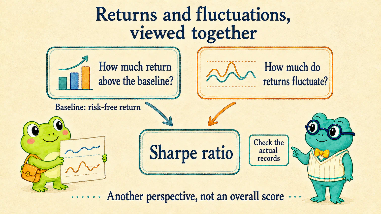
If we choose an approach with fluctuating returns, we can ask: how does the return above that baseline look alongside those fluctuations?
One common measure that brings the two together is the Sharpe ratio. It divides average excess return by the corresponding volatility, expressing the extra return per unit of fluctuation. Here, “extra” means above the risk-free return—not above the CSI 300 market reference. CFA Institute: What the Sharpe ratio measures
For example, with other calculation conventions held equal and the same positive average excess return, the account with lower volatility has the higher Sharpe ratio.
“So which account in our opening chart has the higher Sharpe?”
We need the records to calculate it. We can't hand out a prize by looking at a drawing. Both going from 100 to 120 tells us their cumulative returns match. It doesn't mean their average daily returns or volatility match. Those illustrative curves help us ask a question; they don't provide a Sharpe value out of thin air.
If you want AI to calculate these measures, what needs clarifying first?
Don't mix up annualized growth and the average return used in a Sharpe calculation.
For our simple example, with no deposits or withdrawals and positive starting and ending values:
Annualized return = (ending value ÷ starting value)^(1 ÷ number of years) − 1
Going from 100 to 120 in three years gives 1.2^(1/3) − 1 ≈ 6.27%. If money went into or out of the account along the way, ask AI to account for those cash flows first rather than applying this shortcut directly.
For a historical Sharpe ratio, first subtract the risk-free return from the account return for each observation period. Divide the average of those differences by their standard deviation. With daily observations, both returns should cover the same day. Don't mix a three-year cumulative return, a full-year interest rate and daily volatility in one formula. William F. Sharpe: The Sharpe Ratio
If AI reports an annualized Sharpe ratio, ask it to explain the conversion and its assumptions. Comparisons also need consistent observation periods, data frequency, fee treatment and risk-free return conventions. A zero denominator doesn't allow normal division; it shouldn't be filled in as an “infinitely good” score.
These details help you understand what AI calculated. You don't need to memorize them all now.
Does a high Sharpe mean we can relax?
“So Sharpe helps me compare,” said Hoppy. “But I still need to look at that rough drawdown separately, right?”
Exactly. Sharpe answers part of the question. We still need to look at what happened during the drawdowns.
An approach that was steady most of the time in the past could still suffer a deep fall in the future. And the Sharpe ratio alone won't show when each drawdown happened or how long it lasted.
We don't need to crown a winner for every measure. The measures help us ask a more complete set of questions:
| What do we want to know? | Where can we start? |
|---|---|
| How much did it gain over the whole period? | Cumulative return |
| How fast did it grow, taking the time involved into account? | Annualized return |
| How much did returns fluctuate? | Volatility |
| How far did the account fall from an earlier peak? | Maximum drawdown |
| How did extra return compare with the fluctuations? | Sharpe ratio |
Look at how much it earned, how long it took and what happened along the way. Another measure gives you another piece of understanding—not another guarantee.
Curious? Revisit your own account curve
Review the account curve with AI
Open Codex, or use WorkBuddy, and give AI your existing account curve and results. Ask: “If I only look at the final return, what am I missing about this experience?”
Have it explain using the records you provide. If anything is missing, it should say so, not invent numbers to fill a table. Pick the question you most want to understand, then discuss whether further calculations would help.
Hoppy added “one year” beside those two 120-unit balances. Then he saved the curves between the endpoints too.
“Better than just reading the last line.”
It is. We now have a fuller description of what happened.
But another question remains: how much confidence should we place in that experience? Would the attractive numbers appear again with different samples or a different period?
That's what we'll investigate next.
Lesson discussion
Share a question, insight, or different view—and see how other learners are thinking.