Lesson 4
Turn One Stock into Your First Candlestick Chart
Check the identity, dates, and price relationships in the fictional teaching data before drawing a first local candlestick chart.
At the end of the previous lesson, AI had read the four tables in the teaching dataset and explained what each one contained.
Hoppy listened, then asked one question:
“If we can read the data now, can we draw a chart?”
Dr. Hop reached over and stopped him from pressing Enter.
“Yes. But do not rush. Bad data can still make a very handsome chart.”
Hoppy paused.
“So before we draw anything, we should check whether the data has obvious problems?”
“Exactly. But we are not giving it a complete medical exam today. We only need a few basic checks.”
This time, we will do one thing: choose a virtual company from the teaching data, ask AI to check its daily records, and generate one candlestick chart.
We will not study chart patterns, search for an entry point, or guess what the stock will do next.
A candlestick chart is the first visible proof that our data pipeline works. Producing the chart shows that the program can read and display the current data. It does not show that we have discovered a market pattern.
We will use the teaching data this time
If you have already connected an external data source, you can keep that route.
Different providers may use different field names, adjustment methods, and response formats. To keep our first chart from turning into an API troubleshooting marathon, this lesson uses the Hoppy teaching data already extracted inside the lab.
We will read these two files directly:
hoppy-teaching-dataset/
├── companies.parquet
└── stock_daily.parquet
The first table tells us who a company is. The second tells us what happened to it each trading day.
AI can select our chosen company directly from these Parquet tables. We do not need to create another copy of the data.
If you have not successfully opened the teaching dataset yet, return to the previous lesson and finish downloading, extracting, and reading it. Even a very determined charting program cannot draw ingredients that are not there.
Our shared dataset imitates the structure of daily A-share research data. The companies and asset IDs are fictional, and nothing in the package represents a real investment. Other stock markets may use different display conventions, but the data-reading and checking process in this lesson still applies.
Choose one virtual company
The teaching dataset contains 300 virtual companies. Their IDs and Chinese and English names were created for this course and do not map to real companies.
First ask AI to show you a few, then choose whichever one catches your eye.
Give this to your AI research assistant
Read companies.parquet from the Hoppy teaching dataset in the current project. List five virtual companies with their asset ID, English name, and teaching industry, then let me choose one.
Do not write a charting program yet, and do not discuss which company is more attractive as an investment. Stop after listing the candidates and wait for my choice.
There is no correct choice here.
You can choose a name you like, an industry that sounds interesting, or simply the first company in the list. We are not selecting an investment. We are choosing a subject for our first chart.
Once you have chosen, tell AI clearly:
I choose “Dawntower Green Solutions” (003382). Please continue.
Replace the example name and ID with the company you selected. A name or an ID by itself is also enough. The important part is not to say only “this one,” which can become unclear if the conversation loses context.
You do not need another long prompt. AI can see the earlier conversation; we only need to make this decision explicit.
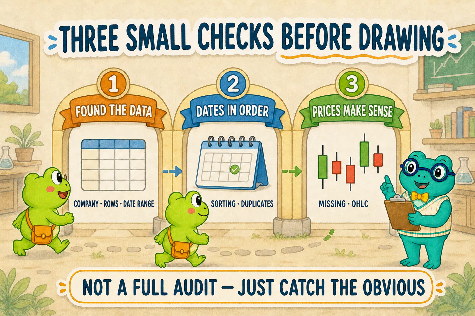
Not a full medical exam—just three checks
Once AI finds the company’s daily records, do not draw the chart immediately.
We will ask it to check three simple things.
First: did we actually find the data?
At minimum, we need to know:
- how many rows there are;
- the earliest and latest dates;
- whether the rows belong to the company we selected.
If filtering leaves zero rows, the company probably did not lose its entire life story. More likely, the asset ID, field name, or filter does not match the real data.
Second: are the dates in order?
Daily records should run from earlier dates to later dates, and the same trading date should not appear twice without a good reason.
Unsorted dates can make a chart jump backward and forward. Duplicate dates can give one day two candles.
So we ask only two questions: are the dates sorted, and are any dates duplicated?
Third: do open, high, low, and close make sense together?
One candle needs four prices: open, high, low, and close.
They cannot be missing, and their relationship should make sense:
- the high should not be below the open or close;
- the low should not be above the open or close;
- the high should not be below the low.
These checks do not prove that the data is perfectly correct. They only catch a few problems that are too obvious to ignore.
Now give AI the charting task
After choosing a company, we can describe the checks and chart in one task:
Give this to your AI research assistant
Use the virtual company I explicitly selected. Read its records directly from companies.parquet and stock_daily.parquet, without creating another copy of the dataset.
First report the row count and date range, whether dates are sorted from earliest to latest, whether any dates are duplicated, whether the forward-adjusted open, high, low, and close values are missing, and whether those four prices contain any obvious contradictions.
If you find a problem, stop and explain it. Do not silently delete, fill, or alter the data.
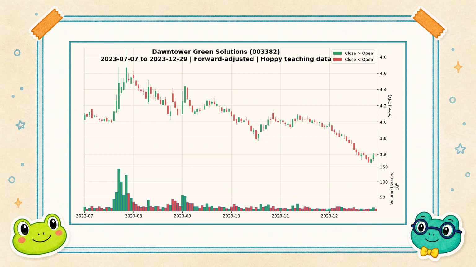
If the basic checks pass, use mplfinance to draw one static candlestick chart for the latest 120 trading days, with volume underneath. First check whether mplfinance is installed in the current project. If it is missing, use uv to install it into this project’s environment, not the computer’s shared Python installation.
Use a common English-language market color convention: green when the close is above the open and red when the close is below the open. Include a small legend that states what the colors mean.
The chart should show the virtual company name and ID, the displayed date range, that prices are forward-adjusted, and that the source is the Hoppy teaching dataset. Generate only this one chart. Do not add moving averages, technical indicators, buy or sell markers, or price predictions.
Save the image in the current project’s output directory. Actually run the program, then tell me where the image was saved.
We are using mplfinance here to avoid creating extra branches for several plotting libraries. AI’s program structure and filenames still do not need to match the course exactly.
We care about three outcomes: the program really reads the data, checks it first, and saves an image we can open.
What does one candle contain?
While AI works, let us look at what will appear on the screen.
One candle holds four prices from one trading day:
High
  │
Close ┐
      │  Candle body
Open  ┘
  │
Low
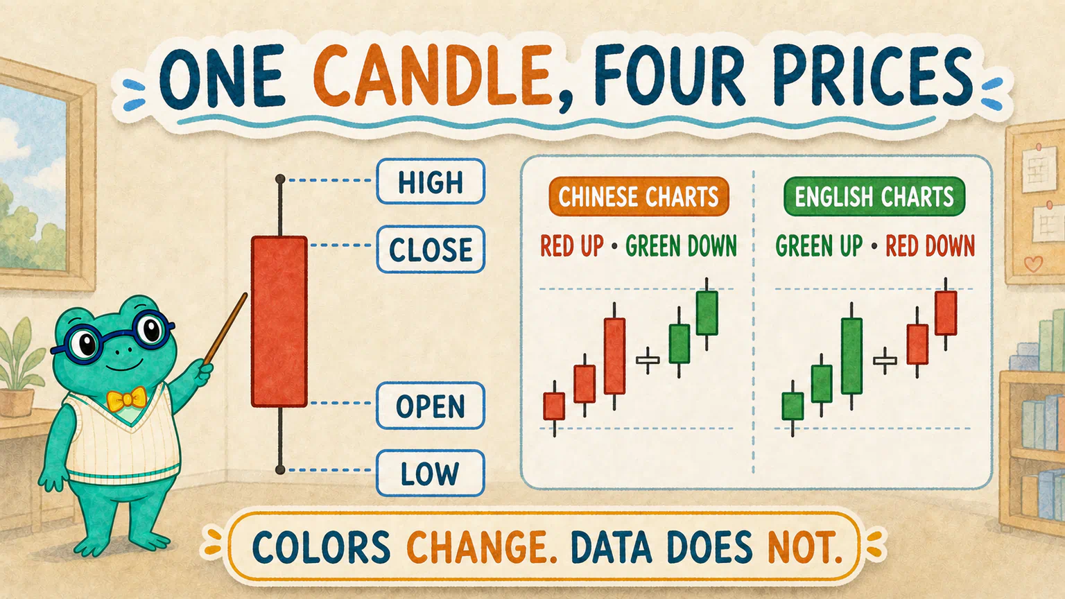
The section between open and close is the body. The thin lines above and below it show the highest and lowest prices reached that day.
If the close is above the open, the candle shows that price rose from the opening print to the closing print. It is often called an up candle. If the close is below the open, it is a down candle. When the two prices are equal, the candle may have an extremely thin body.
This comparison uses today’s open and today’s close, not today’s close and the previous close. A stock can gap down, recover during the session, and still finish below yesterday even though its candle closes above its open. To decide whether it gained or lost relative to the previous trading day, compare today’s close with the previous close.
Many English-language market charts use green for an up day and red for a down day. Chinese A-share charts commonly use the opposite convention: red for up and green for down.
Color is only a display convention. It does not change the underlying prices. Our English chart uses green-up and red-down, while the Chinese chart uses red-up and green-down. Both charts use exactly the same company, dates, and values.
The lower panel shows trading volume. It tells us how much was traded that day, but we will not interpret “high volume” or “low volume” here. We are only displaying information that already exists in the daily data.
Why show only the latest 120 trading days?
The teaching dataset contains three years of daily records. If we squeeze every candle into an ordinary image, each one becomes about as wide as a hair.
So we check the complete series, then display only the latest 120 trading days.
That number is not a trading parameter and has no predictive meaning. It simply keeps our first chart readable.
The checked range and the displayed range are different things:
Complete series: receives the basic checks
Latest 120 trading days: appears in the first chart
We did not remove earlier dates to make the trend look prettier. We simply did not force every date into the same picture.
The chart exists—now open it
When AI says “the image has been saved,” we still have not seen the image.
Open it and check a few ordinary things:
- does the image actually exist?
- can you see both candles and volume?
- do dates move forward from left to right?
- do the title and axes overlap?
- does the chart explain what green and red mean?
Sometimes the program ran successfully, but the title is too long, some text is clipped, or 120 candles feel crowded. That does not require rebuilding the program or changing the data.
Tell AI exactly what you see. For example:
The chart was generated, but the title overlaps the axis. Adjust only the layout so all text is readable. Do not change the data or the checking logic.
This is the same collaboration habit we have been practicing: look at the real result, then fix the problem that is actually in front of us.
Our first chart cannot tell us whether to buy
Hoppy finally opened the image.
Rows of green and red candles filled the screen. He stared at the last few for a moment.
“It has fallen quite a bit. Does that mean it is about to go up?”
Dr. Hop shook his head.
“We have shown only that the data can be read, checked, and drawn. Whether a fall is followed by a rise is a different question—one that needs a definition and evidence.”
A candlestick chart makes it easy to invent a story. A story is not yet evidence.
A chart is a way to present data, not a research conclusion. Without a clear hypothesis, comparison, and test, we cannot infer a market rule from one picture, and we certainly cannot turn it into investment advice.
Our local lab has now touched market data for real: AI can read the Parquet files, find one company, perform a few basic checks, and save the first candlestick chart.
If you are curious, you can keep talking with AI and try another virtual company or another date range. There is no standard variation, and it is not required work for this lesson.
Next time, we will stop looking at only one company. We will expand to many virtual stocks and investigate a question that sounds slightly ridiculous but can still be tested carefully: does the digit 8 in a virtual stock code have anything to do with what happens next?
Lesson discussion
Share a question, insight, or different view—and see how other learners are thinking.